It’s easter and let’s hide a small easter egg in SharePoint that will enhance the user experience a little bit.
Microinteractions are small interactions or animations to give a visual feedback to the user. The following graphic explains the base principle of such interaction.

Definition of Microinteractions
A Trigger initiates a microinteractions. The Rules determine what happens, while Feedback lets people know what’s happening. Loops and Modes determine the meta-rules of the microinteraction.
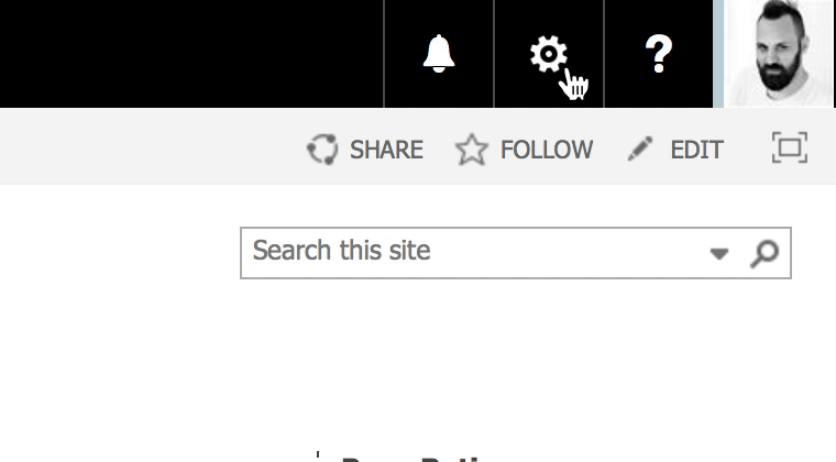
Let me show you a small microinteractions in action by animating the gear icon that can be found in the suite bar of SharePoint.
Rotating gear icon
To let the gear icon rotate only a few lines of code are required. Thanks to CSS3 all that needs to be done is to implement an animation. First, we need to set up the animation.
@keyframes rotating {
  from {
    transform: rotate(0deg);
  }
  to {
    transform: rotate(360deg);
  }
}
We basically need to start the rotation a 0 degree and transform the gear icon to 360 degrees. This makes a full rotation through CSS transform.
Now all that needs to be done is to bind the rotation animation to the gear icons.
.ms-Icon--gear:hover {
  animation: rotating 2s linear infinite;
}
The reference to the animation is defined by the ‘animations’ CSS property and calls the ‘rotating’ code. A full circle of the rotation takes two seconds. So after two seconds all pixel returns to the their original position. The last two parameters just define the timing of the animation. Linear makes a smooth constant transformation of the rotation. Infinite defines that the animation only stops after the cursor is not over the gear icon anymore.
Rotate gear when menu is open
This small animation works well as long as the icon will be hovered but when the menu have been opened the rotation stops immediately. So have continues rotation even when the menu is open we need to assign the animation to another class too.
When the menu has been opened SharePoint assign an additional style sheet class to the button containing the gear icon.
.o365cs-spo-topbarMenuOpen .ms-Icon--gear {
  animation: rotating 2s linear infinite;
}
After this final adjustment the icon rotates, who it will be hovered and the menu was opened. The user now knows visually that they have opened the settings menu.
Microinteraction – animated gear icon
Final code and considerations
Sometimes only the small things matters and in this case it is not even complex to accomplish. Now we have a more interactive user interface that gives the user additional information. Microinteractions such as this we currently see on a lot of web sites and is absolutely a great thing. Fun for developers to develop and useful for users.
Happy Easter
Do you know how we can do this in SP2013? Rotating the icon is fine, but I’m not sure how to keep it rotating once the Site Actions menu has opened.
You need to check the class that will be assigned to the opened menu. Might there is some difference to the online version or an different class will be used.